Making a Splash in an Ocean of Competition
There's no question that every person in your market will probably see thousands, if not more, of pieces of information vying for their attention every day. To make your message relatable, or even better shareable, creativity is key. Showing your audience something new (or just something old in a new way) will help you soar past just getting their attention, and lead your message into the realm of getting remembered. And if one person remembers and decides to share your message, well then you have truly created something great.
That said, it's not an easy task. Great ideas just don't magically form overnight out of thin air, and that's why there are plenty of other people out there who do it for a living. We're not all creatives and we're not all great and taking that creativity and forming it into something worthwhile and meaningful. So take a peek below at very good examples of print ads that really stand out and hopefully one of them will inspire you do create a creative ad of your own. But even if none of these sprouts a great idea for you, they are still fun to look at.
See below for the original article by Rebecca Gross

Break through the advertising clutter with a solid concept and creative design. We are constantly exposed to advertising in our daily lives, be it online, in print, on billboards or through our television screens. In fact, research suggests we are exposed to, on average, 362 ads per day (not including brand exposures) but only 3 percent of these will make an impression. That’s just twelve ads a day that actually engage us. So how do you break through the advertising clutter and make a memorable advertisement for your audience or target market? First come up with a solid concept and then consider your design. Attention to layout and presentation will help your ad get noticed; but attention to concept and creativity will help your ad be remembered.
01. Use the fold
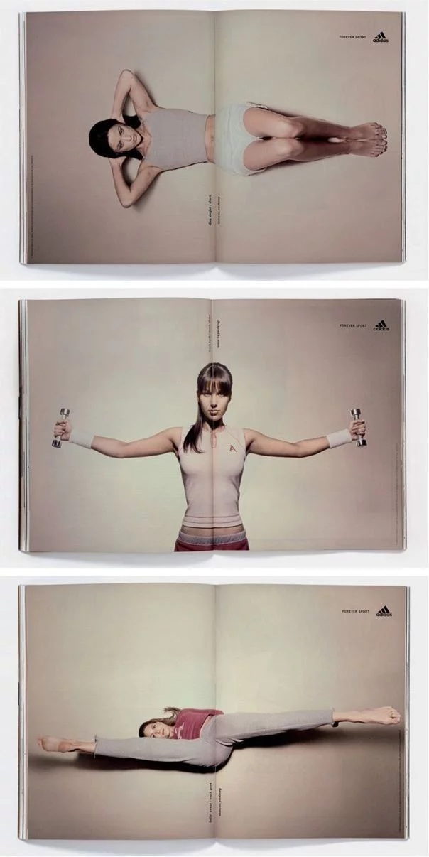
This double page spread for Adidas: Forever Sport uses the fold as part of its design. Open and close the pages and the athlete crunches, lift weights and stretches.
02. Make your audience look twice
Nobody likes bumper-to-bumper traffic – except perhaps motorcyclists who can dodge and weave through trucks, cars and buses like a maze. Honda Motorcycles captures this idea in a series of print ads that feature a variety of vehicles distorted and laid out like a maze.

03. Use animals to send an important message
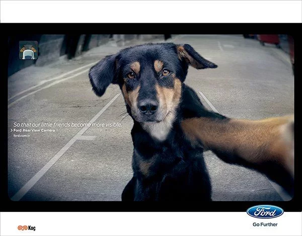
A dog taking a selfie? Not quite. This ad by Ogilvy Istanbul is for Ford’s Rear View Cameraand it features a dog staring straight into the camera – in effect, straight out to the audience – to bring feeling and emotion to an important message.
04. Remind your audience of what other people live with
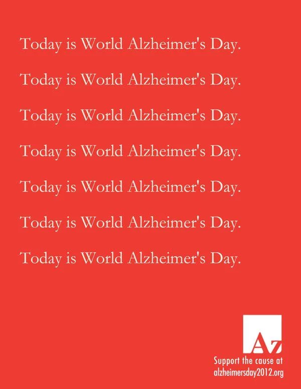
Alzheimer is a debilitating disease that causes disruptive memory loss and those living with Alzheimer need to be constantly reminded of things in order to get through the day. This print ad by Simone Mascagni plays on that repetition, promoting World Alzheimer’s Day and reminding audiences of the challenges of Alzheimer.
05. Play with the magazine format
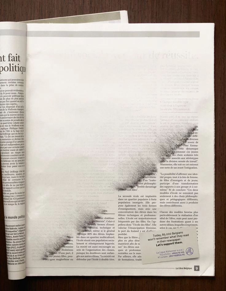
This ad for Alzheimer’s Day by Publicis in Belgian also has a concept based on memory loss. Using the format of the magazine medium, the ad shows ink dissolving or being brushed away, much like the memory of those living with Alzheimer.
06. Make use of newspaper columns
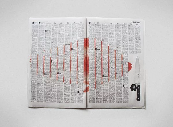
Likewise, Ogilvy & Mather in Columbia used the columns of the classified ads to promote Carulla Knives. A series of ads show images of fish and vegetables sliced and diced between the columns in the newspaper.
07. Transform objects into parts of the body
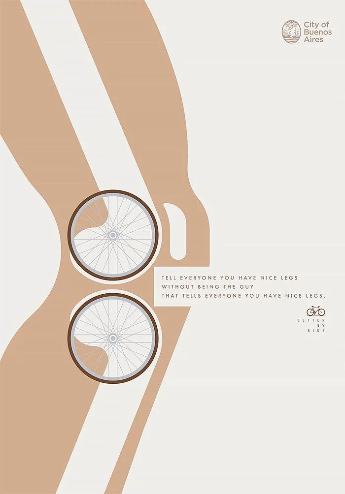
Bike machinery becomes body machinery in this ad by Argentenian studio La Comunidad promoting the health benefits of cycling. Concept, design and consistency makes for an aesthetically appealing and easy to understand campaign.
08. Turn the brand name into an adjective
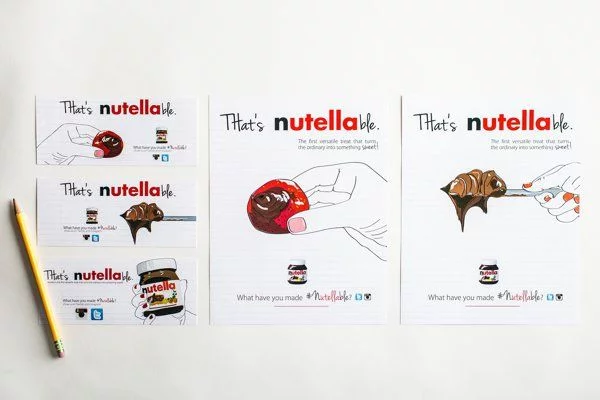
Claire Heppner turned the brand name of everyone’s favourite spread into an adjective and showed some of the ways Nutella becomes ‘nutellable.’

09. Use storytelling
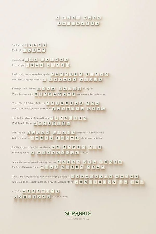
Who doesn’t love a good story? Marketing agency Lola Madrid used anagrams in a series of ads for Scrabble to tell a love story for word lovers. Lola executive creative director Pancho Cassis told Adweek the primary goal was “to convey that words are magical and powerful, and that they connect us with people.”
10. Reinterpret a famous image
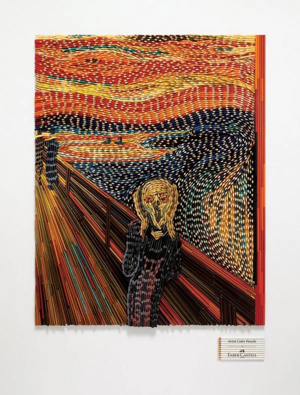
To promote Faber-Castell’s range of “Artist Color Pencils” Ogilvy & Mather Singapore recreated famous paintings using thousands of color pencils – not to draw the paintings but as the actual medium. Look closely and you’ll see a sea of pencils meticulously planned and glued to reinterpret Edvard Munch’s “The Scream.”
