The following article was originally published by Promo Marketing. To read more of their content, subscribe to their newsletter, Promo Marketing Threads.
Back in 2012, the Australian federal government lobbied hard to change the description of Pantone 448 C from “olive green” to “drab dark brown” after the country’s olive association expressed concern that being tied to the color would damage olives’ reputation. That's when it became obvious we had a forerunner for the title of “the world’s ugliest color." Findings from a marketing research firm made it more or less official, when a survey of 1,000 smokers selected it as the least appealing color.
Fast forward six years, and we have additional proof that Pantone 448 C continues to offend the masses, as multiple countries—including Australia, following that marketing study—have enlisted the shade on cigarette packaging as a symbolic condemnation of indulging in nicotine.
The Pantone Color Institute has been choosing a Color of the Year since 2000, and unlike Time Magazine, which has picked controversial figures such as Adolf Hitler and Joseph Stalin as its Person of the Year, the entity is not ever likely to have someone question its sanity by giving Pantone 448 C any serious consideration. We must say we would love to trot out the headline “Hue Have to be Kidding Us” if that were ever to occur, but, we are pretty sure the public will end up spared. Why is that? Well, simply put, there are only so many times that a shade could draw comparisons to fecal matter before one has to say, “Wow, it does look like that!” If that excretion is not your preferred one to compare it to, you are certainly not alone, as the disdain for Pantone 448 C has been growing since Australia’s aforementioned critiques of it.
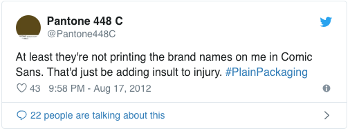
It's become something of a phenomenon in the color world. Google "Pantone 448 C," and mixed in among the news stories about its use in packaging are plenty of impassioned defenses, like this one, and this one. and this one, etc. Someone even created a Twitter account for the color (though it hasn't been active since 2012):
We have taken delight in relaying the institute’s color-of-the-year verdicts, as the chosen ones, not to mention other Pantone family constituents, have gone on to have significance for brands in terms of logo determination, marketing strategies and more. However, it benefits us and you, too, we feel to look at a less-than-stellar perception of another color in the institute’s crayon box.
Israel has positioned itself as the latest country to seek to associate the drab tone with the deleterious effects of smoking, with its plan calling for the banning of logos on packs and the uniform use of Pantone 448 C—also dubbed opaque couché—on packaging. Further limiting brand awareness, the powers that be aim to shrink the size of the product names and will have health warnings dominate the front and back sides of the packs.
Regarding the warnings, we know that people will continue to smoke no matter how many admonitions or images of diseased lungs appear on cartons of packs, but we find ourselves curious to see what engaging in a bit of color psychology will do for end-users’ reliance on cigarettes. No color has won universal acceptance as a positive hue, but since Pantone 448 C has gained unwanted traction as the world’s ugliest choice, could Israel—which has company in such lands as Australia, Great Britain, France and Northern Ireland in calling on bland packaging to curtail smoking—see a drastic reduction in cigarette sales? Is the widespread repudiation of Pantone 448C an indicator that it will go on to become an even greater resource in helping other countries to limit smoking?
We certainly like the irony that color, a tool commonly used to compel consumers to purchase a product, could come to have far-reaching use as an agent against the buying of a commodity. The overall matter, however, makes us wonder about your take on Pantone 448 C. Have you used it in your product lines, or have you likewise sided with the camp that declares it “the world’s ugliest color”?


